Another interesting (and very useful) customization I’ve been recently asked to do is a visual representation of the stored grades distribution by school/year/grading period (store code).
You start by choosing the school from a drop down box of schools in your district.
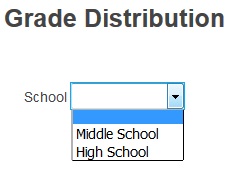
After choosing the school

you will be presented with another drop down box listing the relevant school years.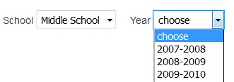
Again, after choosing the year
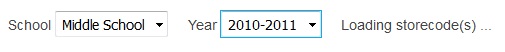
you’ll see yet another drop down appear, a drop down containing all the grading periods/bins (for the previously chosen school and year) that have stored grades in them.
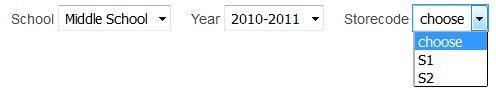
Once you’ve chosen the store code/grading bin you’ll have the option (the drop down on the second row) to order your grades a certain way.
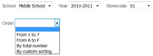
What the options mean:
- If you leave the field blank than the grades on the graph will be ordered “alphabetically” (A,A+,A- a.s.o. for letter grades and 1,2,3 a.s.o. for number grades).
- “From 1 to 7” – grades from 1 to 7 are listed first, from left to right, everything else comes afterwards ordered alphabetically.
- “From A to F” – proper ordering of letter grades (A+,A,A- a.s.o.), everything else comes afterwards ordered alphabetically.
- “By total number” – it counts the number of occurrences of each grade and orders them “ascending” (from 1 occurrence to 1000, let’s say).
- “By custom string” – allows you to choose, from the list of possible grades, the order in which you’d like them to be displayed (use drag & drop to move the grades around and change their left-to-right display order).

Whatever your choice was at the previous step, you can now press the submit button to see the results.
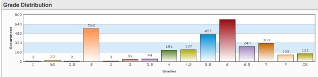
Below are some examples of how the graphs could look like, depending, of course, on your own grades in the database (and the order you choose).
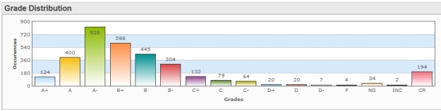
Letter grades, ordered “From A to F”:
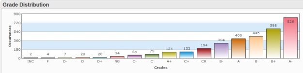
Letter grades, ordered “By total number”:
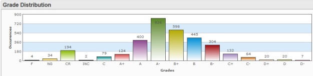
Letter grades, ordered “By custom sorting”:

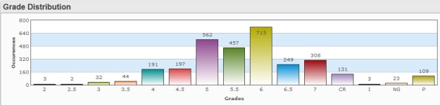
Number grades, ordered “From 1 to 7”:
Number grades, ordered “By custom sorting”:

You could also report on, based on the same logic, the number of failed or incomplete grades (vs. total grades), or even create an extra option to the order drop down called “failed grades first” (to show first the failed grades and then the rest), for example.
There is virtually no limit to what can be done (counted, displayed and analyzed) on the pattern above as long as the data is there, in your database, and it is consistent (that’s extremely important when you’re doing statistics/graphs).
You can download this customization (as a PowerSchool plugin) here or here. Once installed, you will find its main page called grade_distribution.html under /admin/dashboard. You can then create a link to this page and add it to the left-hand menu or pretty much anywhere you want.
You can email me any comments or questions you might have.